A series of research studies were conducted on the learning styles of college students and their utilization of third spaces in-between classes. A third space is an area outside of the classroom where students can spend free time within university buildings. These spaces can be programmed for studying, collaboration, social connectivity, and more. Observational studies were conducted at Stillman Hall to identify pain points in the student experience which led to the development of design solutions.
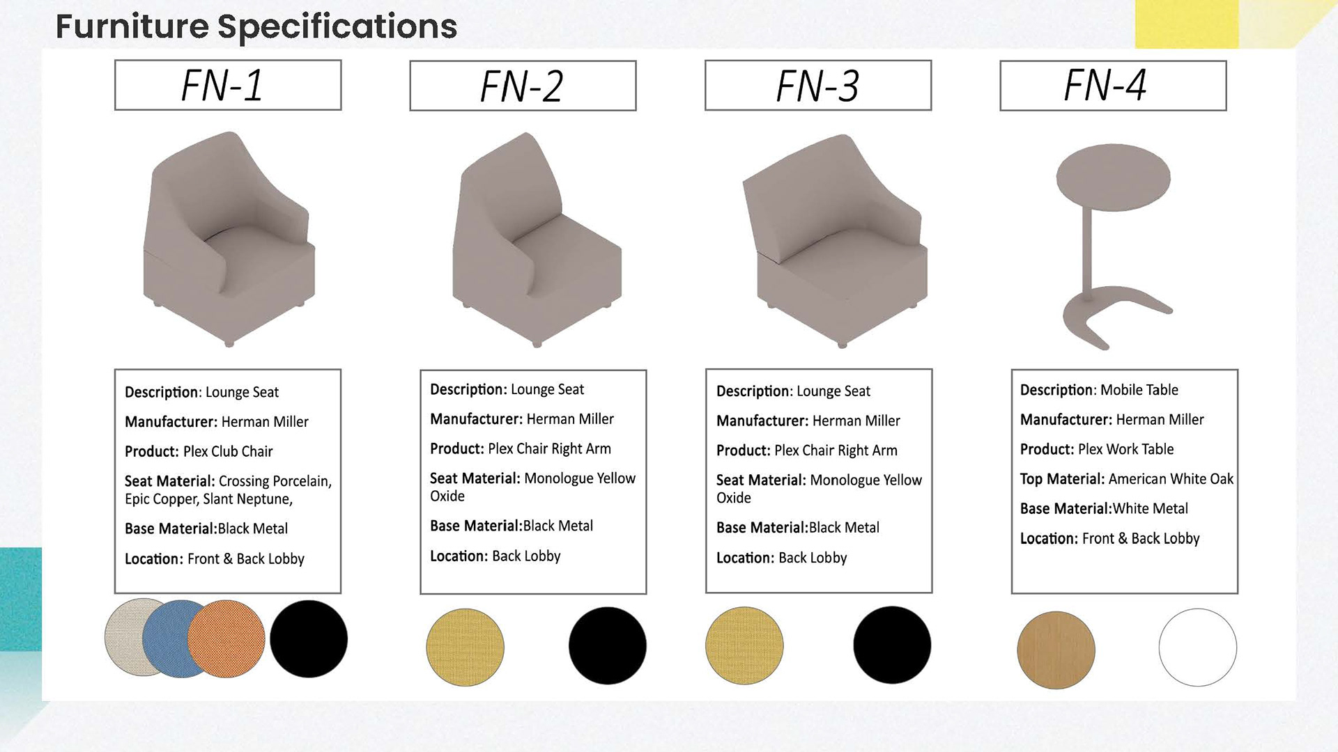
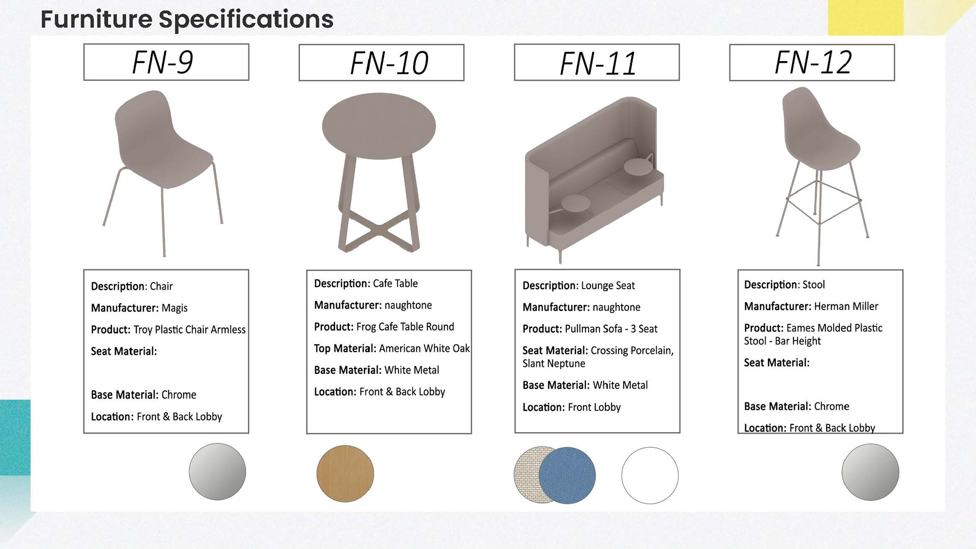
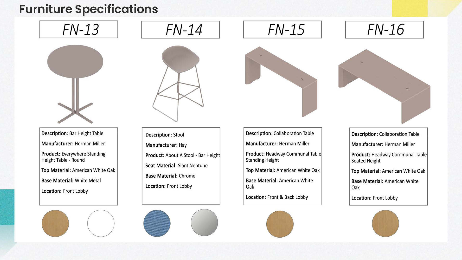
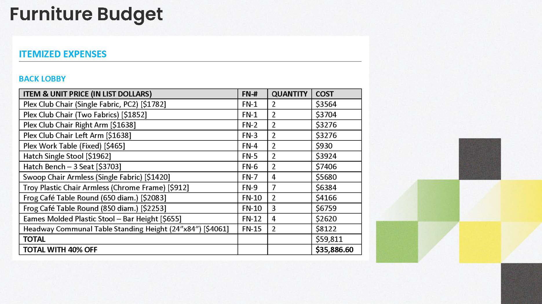
This semester long project was developed in collaboration with Herman Miller as a sponsor of our Interior Design studio and a resource on higher education design. All furniture incorporated in this project is from Herman Miller or their family of brands. Itemized furniture specifications and furniture plans were developed during the re-design process with a furniture budget of $100,000.
Front Lobby - Left Wing
Front Lobby - Right Wing
Back Lobby - Entrance Space
Back Lobby
Concept and Strategies
Stillman Hall, housing the social work major classes, invites students to sit down and stay through the use of a warm color palette, soft textiles, and comfortable seating. A variety of furniture groupings provides students with the flexibility and support for any activity they chose to engage with between classes. Students can find a moment of pause and comfort within the lobby-like spaces. Lighting, accent walls, and graphics add visual interest to the space and reinforce the pride of being an Ohio State student in a socially connected major.
Material Palette
Visual Positioning Board
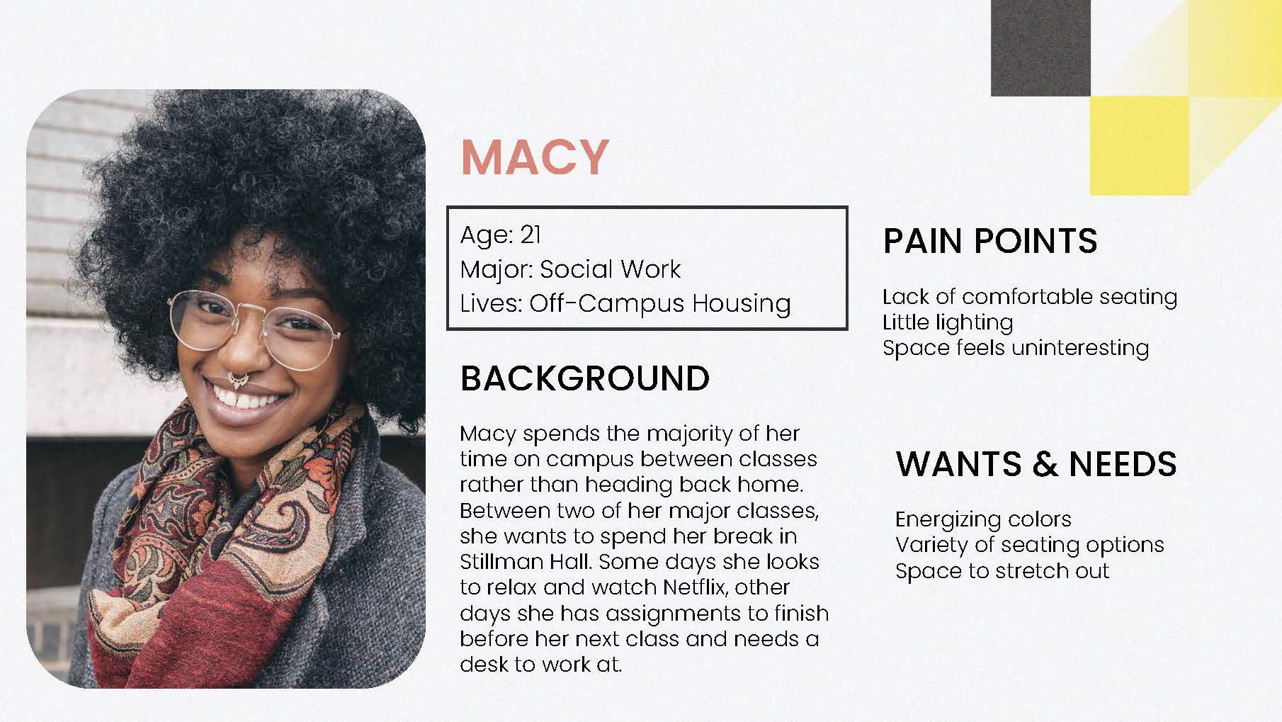
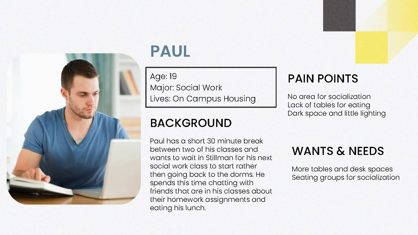
Personas
SITE PLAN
FRONT LOBBBY FLOOR PLAN
STRATEGY
Warm colors highlight spaces of community and comfort while cool blues are primarily utilized in areas of seclusion, like tables in the corner and individual seats at the high top desk.
Topographic variety is provided through the use of both seated and bar height tables at the same arrangement
Strategies of Inviting and Pride are shown through graphic elements in the left lobby. The graphic displays a diverse population of students and the phrase “Together as Buckeyes” above to promote inclusivity and a welcoming energy. Wooden slats and a dropped ceiling create visual interest and provide a refuge space. A wall covering material on the right side lobby also adds to the visual interest to the space.
Floor Plan With Detail Call Outs
BACK LOBBY FLOOR PLAN
STRATEGY
This space is right outside an “Active and Pool Classroom.” The space is intended for social interaction, an a open environment that encourages noise.
Upon entrance, students are greeted with a graphic that compliments the color scheme of the area and ties together the areas of invigorating energy with the supporting quiet spaces.
Wooden slats repeat to create another cozy and welcoming area for students to rest. The dropped ceiling breaks up the traffic pattern and creates an intimate environment.
Bright lounge chairs surround a large column that’s highlighted with lighting to create the main point of visual traction. The column draws students into the flexible and multi purpose workspace.
Floor Plan With Detail Call Outs
interior Elevations
FURNITURE SPECIFICATIONS


